

Prefecture 48
四十八県
Japanese Precinct — Sydney
Brand Strategy, Brand Identity, Print, Ongoing Creative Consulting & Support
Every Japan through our arches.
↳ Task
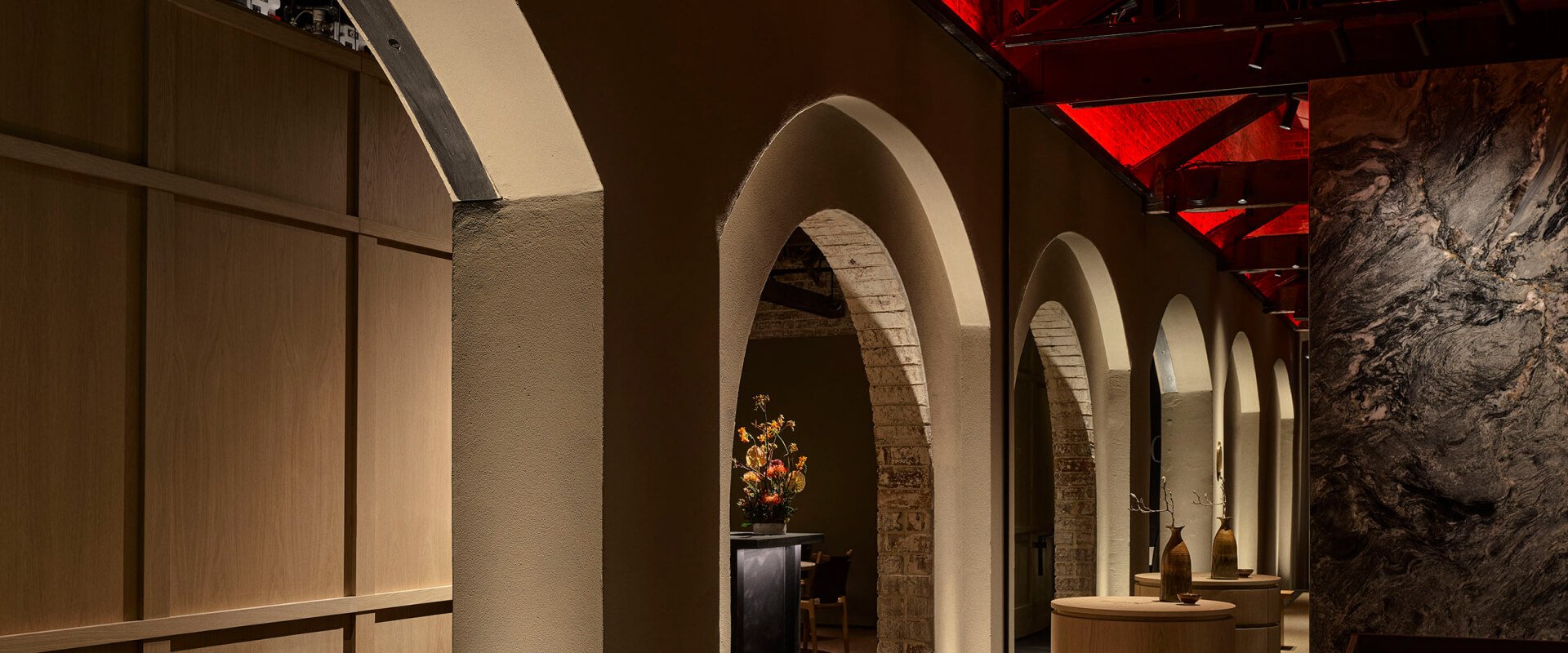
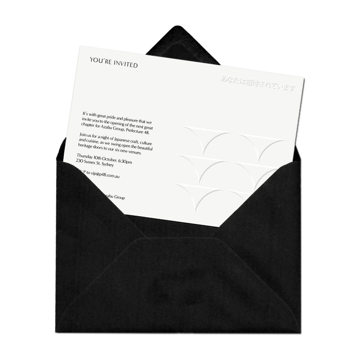
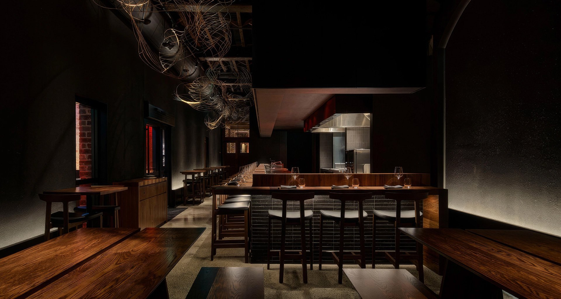
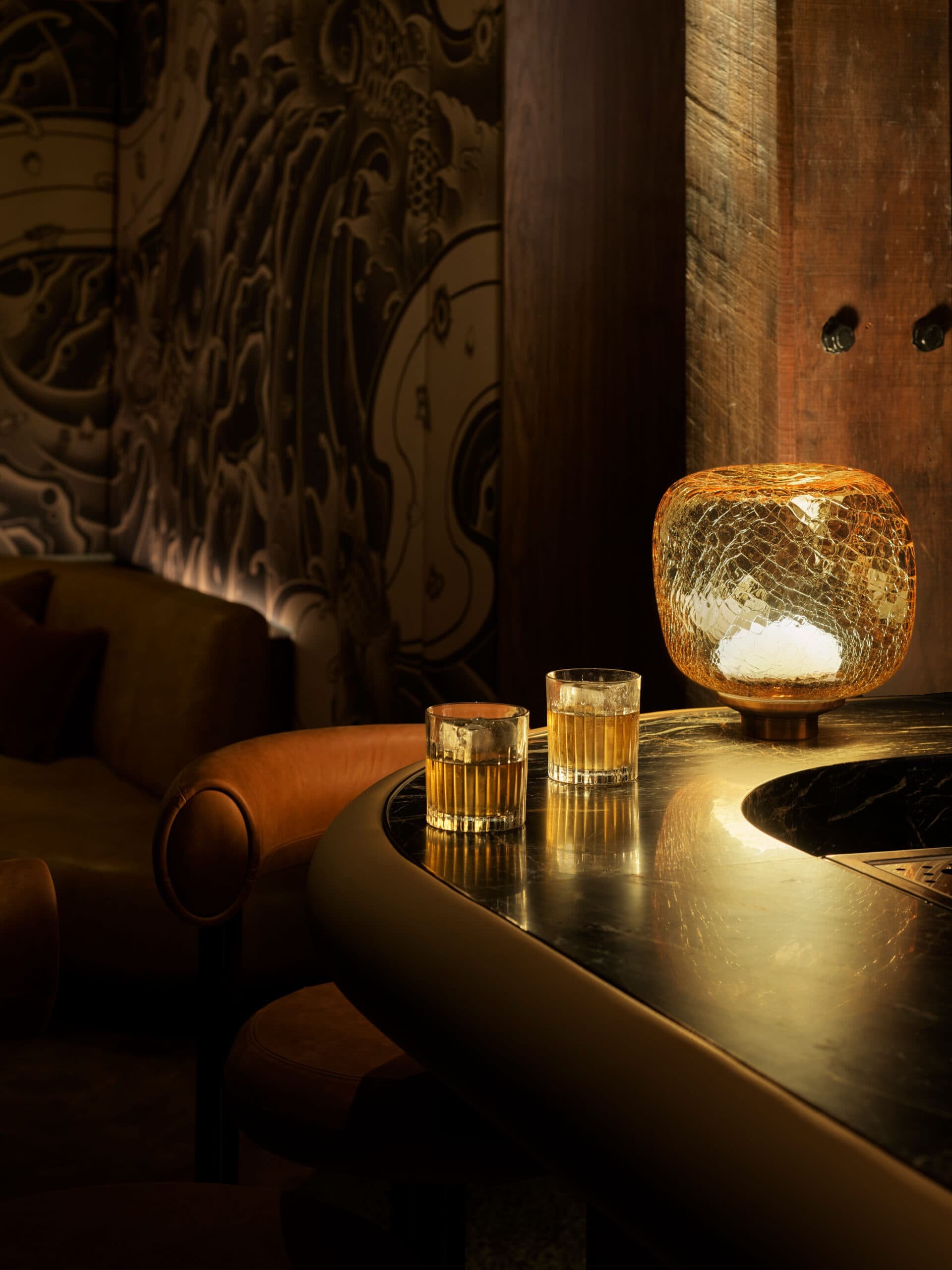
Nestled within the arches of a heritage building, Azabu Group has created the 48th Prefecture of Japan.
Prefecture 48 is Sydneys next exclusive dining precinct with a stunning collection of 6 Japanese restaurants and bars, carefully designed and constructed by some of Sydney and Japans most talented craftspeople.
Magnus Design Office created the branding for Prefecture 48 by working closely with Azabu Group from the beginning to craft a brand strategy and identity system for the precinct and the venues within it, all of which needed to reflect the culture, craft and values of Japan.
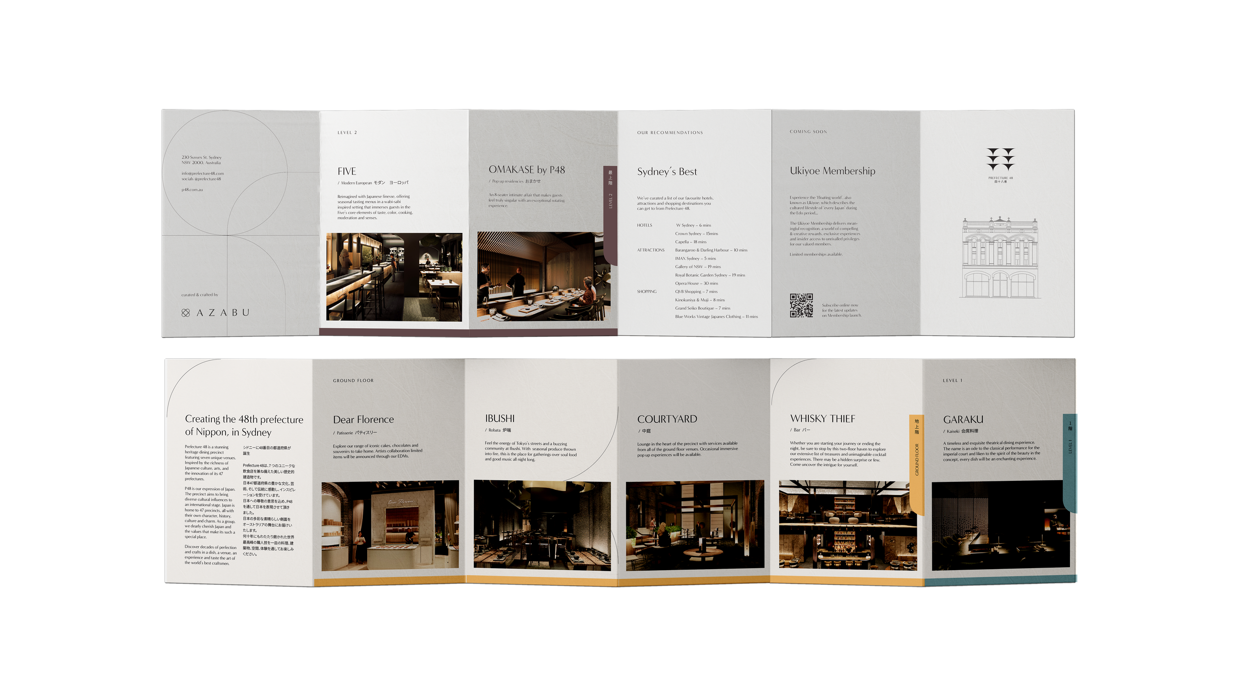
For this project we developed brands for Prefecture 48, Ibushi, FIVE, Omakase by P48, Whisky Thief and Garaku.

Naming & Positioning
This project started with a vision by the owners to have a precinct that showed the many and varied sides of Japan throughout its different venues - the new, the old, the outlandish and the understated. Because of this we approached the project like we were branding a nation, rather than a hospitality venture.
This concept of nation branding is where we developed our name strategy. Japan is made up of 47 beautiful and unique prefectures, so we wanted to position our venue as the 48th prefecture of this beautiful country.


Visual Identity
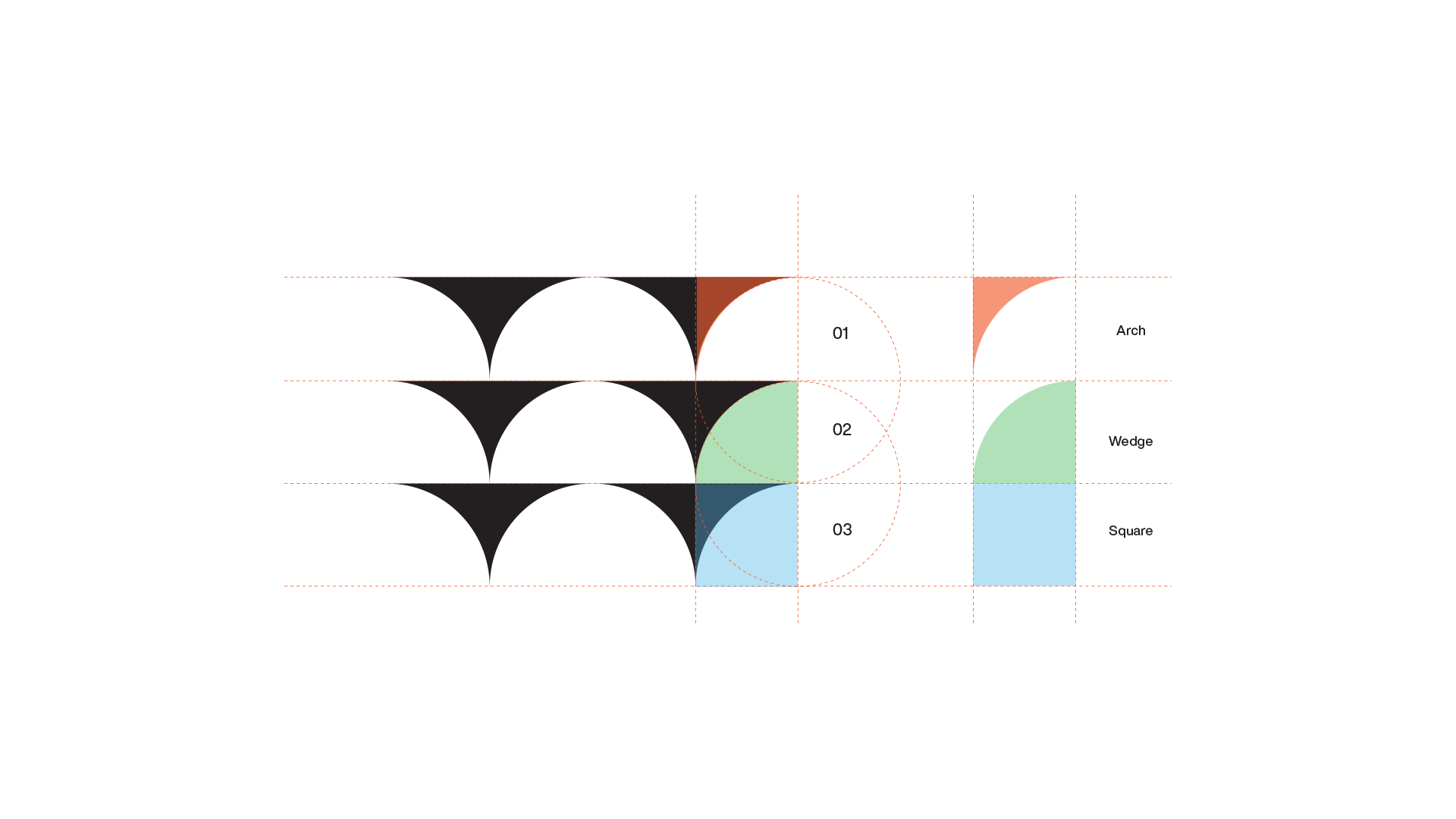
P48 needed to be a single identity that told several stories. We did this by looking at the building that was going to house all these stories.
The standout feature of the building is the repeated arches, both inside and outside of building. The Prefecture 48 visual identity is a representation of these arches across the three levels. These arches also reflected the shapes of the ancient Torii gates from Shinto temples and Pagodas of the 7th century.
This linked our building to those of Japan.


Application
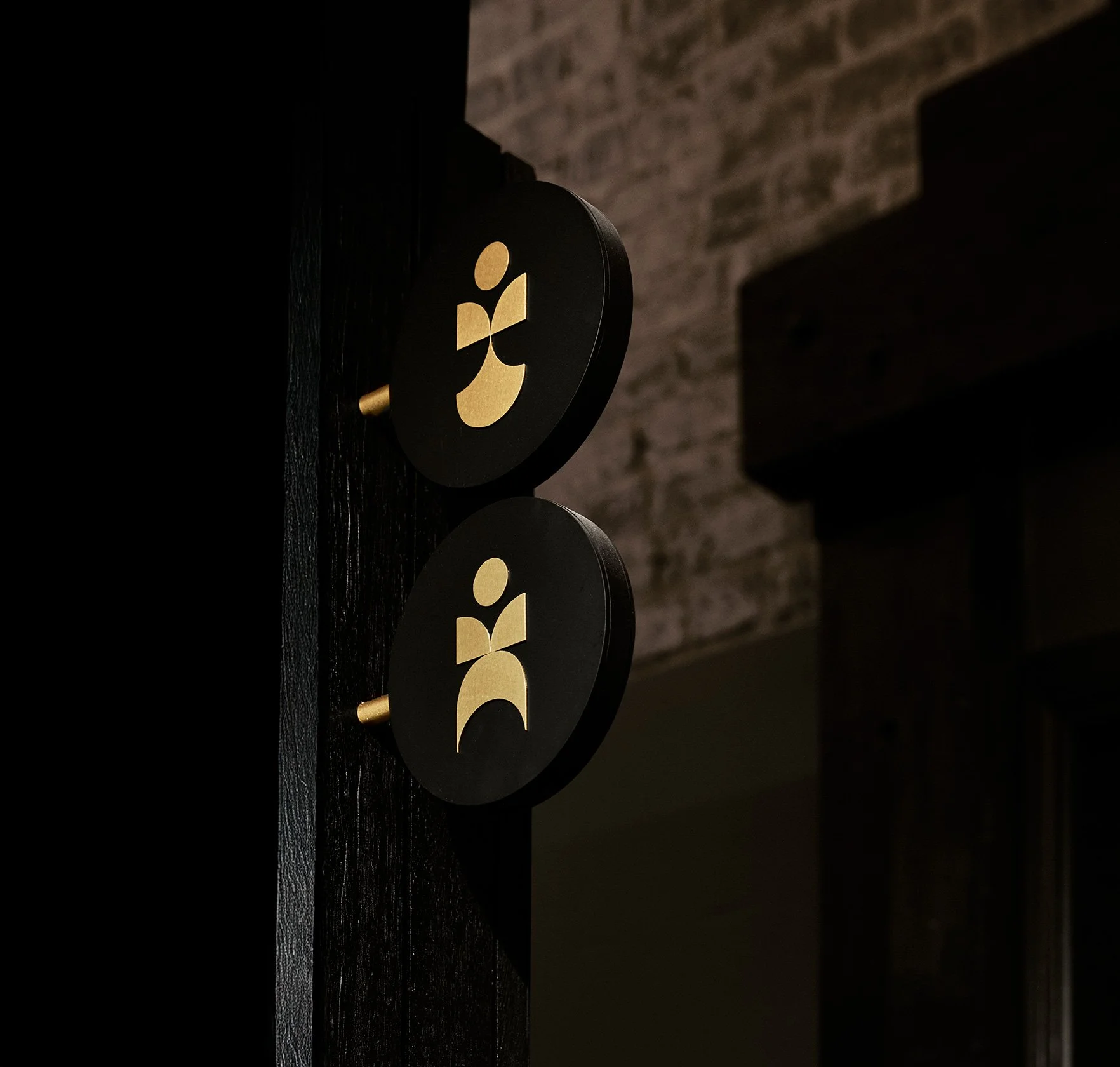
From our arches we took a series of shapes which we used as the building blocks for a various graphical devises, which are used across various brand applications. This further reinforces the central idea that within the arches of our precinct are many possibilities.


This project was about transplanting one culture into another, and blending them to create something authentic to each.


P48
Credits & Collaborators
Architecture by Bates Smart
Photography by Anson Smart